Monday
Experimental, LOVE IT!
video filmed on vhs camcorder
By Daniel Swan, a student studying graphic design at camberwell. The 2 video's of his I've included here really make me want to experiment with film.
Bruno Dicolla - Return as an Animal
Shortmovie about the myth of the eternal return of life after death.
Friday
Photographer, Tim Walker
Photographer Tim Walker has a fantasy approach to his work. He has shot spreads for magazines such as Vogue and is now turning his hand to direction. With a short film called The Lost Explorer which is about an adolescent girl who discovers an otherworldly explorer at the end of her garden. Looking at his photography I'm actually quite excited to see this film as judging from the plot I can just imagine how it's going to look. I really, really want his book - Pictures. It's kind of a diary/collection of photographs, with sketches in showing the influences behind his shots. I love seeing the influences to peoples creativity.
Thursday
bars
bars, originally uploaded by aarinsmith.
I found this on flickr, rather random/interesting. I like the colours and how the shapes warp.
Thoughts for references in Visual Essay.
I've thought quite abit about what I want to include in my visual essay, and what sums up why I'm picking the pathway I am. I've decided in my 3 practitioners I want to include a photographer/director who I am consistantly inspired by, for example Nabil Elderkin or Pierre Debusschere. I would also like to include a video house if you will. A collective of directors, multimedia practitioners and graphic designers eg. Colonel Blimp, Davey Inc., Flynn, The Wilderness. Possibly a graphic designer who works both in film and graphics like Julien Vallée. I basically want people who work in different medias. I would like to make a short film which is a culmination of all these influences too to use in my essay. Possibly some photography and design work. Also been thinking about what I would like to accomplish if I do ever get really successful. 3d is an interesting area, I've never really thought too much into it as it is still in its infancy, but can you imagine in a few years the kinds of things that would be able to be accomplished with it. I know that sky is bringing out a 3d service soon and that 3d broadcasts are already happening. I would love to be able to explore this in my work somehow.
Sunday
Pierre Debusschere
Found Pierre Debusschere yesterday and I really liked his work, so I decided to look into him a bit more as I'm considering using him as a reference in my visual essay. His style is very inspiring, and I also like that he is a photographer as well as a director. His work is beautiful, I love his use of colour and lighting, which again is reflected in his direction. I've picked out some of my favourite images here, with a little bit about why..
COLOUR! I love the contrasts of colour, pink, green and blue are a winning combo in my eyes and here they work so well together. Although they are quite feminine, sweet colours, there is a sense of melancholy and confusion which is clearly portrayed through expression and body language. This is a filed on his website as a fashion portrait, but I think it is a strong piece on its own, as the person photographed seems to draw you in and allow you to create your own narrative.
<3 the colours and lighting.
"Belgian photographer and filmmaker Pierre Debusschere has become a regular contributor to severals fashion magazine like Dazed & Confused & fashion brands . From documenting photo shoots to producing exciting, original content & editorials and covering fashion week shows, Debusschere’s work embodies the multimedia crossover pushing a new way of seeing and creating a fashion image."
Pierre Debusschere for Romain Kremer
I really like this video for Romain Kremer fashion house. Bizzare stuff altogether, but I really love the use of lights and overlay in the clip. I think that something like that would work really well as a dream sequence in a film, for example.
ROMAIN KREMER from pierre debusschere on Vimeo.
ROMAIN KREMER from pierre debusschere on Vimeo.
Fred Butler
Fred Butler designer of such beauts as this headdress...
her website is really interestingly designed. I'm liking the quirkyness of it. Although it's not really practical but it fits with his style really well.
An avant-garde work pushes the known boundaries of acceptable art sometimes with revolutionary, cultural, or political implications.
her website is really interestingly designed. I'm liking the quirkyness of it. Although it's not really practical but it fits with his style really well.
Avant-Garde
The French word for vanguard. A group or work that is innovative or inventive on one or more levels: subject, medium, technique, style, or relationship to context.An avant-garde work pushes the known boundaries of acceptable art sometimes with revolutionary, cultural, or political implications.
Friday
What do I want to do...
I have been looking lately into what jobs I can get as a result of this degree. I have sat and thought about what skills I feel I am strongest and most confident in, and what aspects I enjoy in my work and in the design process overall. Looking back on my blog from the past few months I can see myself that I tend to use this as a place to keep images, videos and the inbetween of what I find influencing and interesting, and draw from these to create a piece of work that I am happy with as a realization of them. I never really thought about it but researching can be just as much of a job as being sat behind a computer creating a 3d environment, or coding a webpage. It can be a job role in itself, then while looking into jobs I found Flynn. A successful company that creates "live action, animation, photography and design work across the board." When looking at their about section I saw that they actually have information about the people who run the behind the scenes, if you will, of the company. The role which stood out most to me was Head of creative department, and when I read the role of his job "assisting directors across Promos/Commercials/Flynn Post and acting as Flynn's nip/tuck treatment surgeon." I kind of thought, "yeah I would love to do that". To see these kind of jobs are about has put me at ease when thinking about my future. It has also helped me to see what part of the course would be most suitable for me to specialize in, as I've been a bit on the fence between animation and moving image. (When I first posted on this blog my post was a mix between those two as well, which makes me think that it was kind of obvious all along). But looking at 2nd years animations, seems that it will be working in programs like 3D Studio Max and Maya etc. However in moving image there is always the option to bring digital elements into film... a bit long ramble but yeah.
Happy times?
Happy times?
Thursday
The Maccabees ft. Roots Manuva
perfect. i love it when the shots flicker at 2:32.
Production company - Davey Inc.
Directed by Alexander Brown
The director directed all of La Roux's art work too. Which is quite impressive.
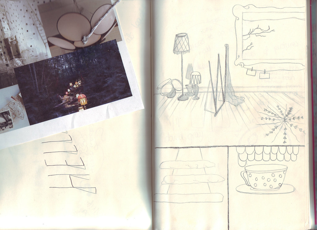
sketches of what I want my lair to look like.
lots of lamps. that's a "W" coat stand. why not. and thats a window that looks like a picture frame. i'm also thinking a light switch that changes day and night. the bottom left sketch is the kind of spire thing i want going on, with clouds around it. i've had so many ideas then when i go to draw them my mind draws a blank.
Eugenio Recuenco
A spanish photographer and set designer. His works are very dream like, and cinematic. I find him really influencing. His pictures are quite dark, but still beautiful. They remind me of classic Victorian painters.
Monday
Bit of design stuff :)
The bar I work at asked for a poster to go within the bar itself to promote a night that's starting soon. Here's the initial ideas for one of the posters...
They asked for a summer vibe and wanted the main focus to be the offers on cocktails, although I think that the date and type of music need to be more of a focus also. The image is just a temporary one, as I didn't actually draw that picture, it was to imply where an image will go. But cause they liked the effect of it I'm going to recreate it myself and use my own version instead.
This is the second draft, still using the image for illustrative purposes.
Comments/criticism/ideas more than welcome.
They asked for a summer vibe and wanted the main focus to be the offers on cocktails, although I think that the date and type of music need to be more of a focus also. The image is just a temporary one, as I didn't actually draw that picture, it was to imply where an image will go. But cause they liked the effect of it I'm going to recreate it myself and use my own version instead.
This is the second draft, still using the image for illustrative purposes.
And another slight variation.
Sunday
Well I found this quite interesting...
There's a big long explination of what this is on the description, so I wont regurgitate it since I don't really get it completely but what I love about it is the last paragraph in the description -
How much of what we think to be random is really random, or could it be that we just don't understand a simple set of rules that can explain it. Perhaps God isn't playing dice after all.
...That concept makes my brain hurt... I think I just fell in love with it.
Subscribe to:
Comments (Atom)


