David Wilson Creative
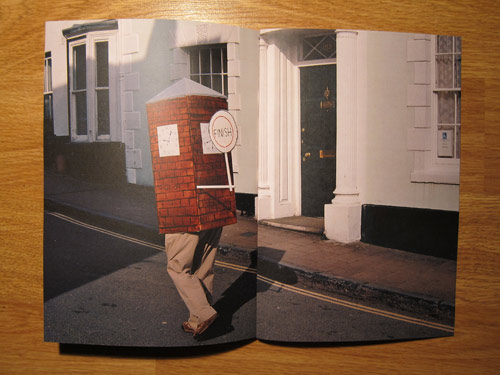
David Wilson's website/portfolio follows a similar layout to indexhibit, it's simple and effective. Colour schemes are implemented to separate each medium he uses, work is displayed with a short explanation and date.
Saturday
Tuesday
Moodboard
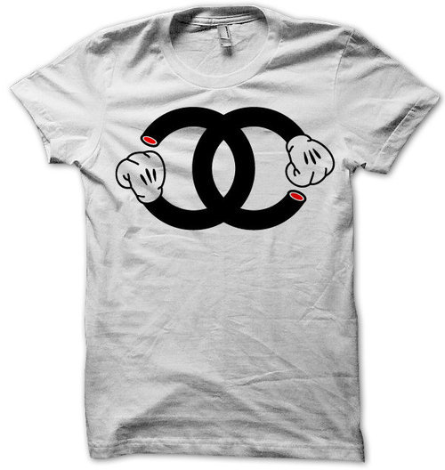
Someone please tell me I'm not the only person who completely loves chanel knock offs like this? I really want one but I've not seen one that's tickled my fancy enough to get one.
I finished the moodboard, missed a few images off by accident so I'll just leave them at the bottom here..
I finished the moodboard, missed a few images off by accident so I'll just leave them at the bottom here..
Also some portfolio websites, obviously theres thousands upon thousands these are recent ones I've come across;
Boom Bear Logo
This is the logo style I'm aiming for. I'm currently knocking up a vector now and I'm gonna make a stencil out of it and get some paint and glitter in the mix in the next couple of days. I'm heading back to Manchester this coming weekend so hopefully I'll get some inspiration while I'm there for some work I can get on with. Done more illustrations too to get in practice for the title sequence I'm hoping to get done. Just looked back at this logo, I love this logo, why did they think of it first?
website
I've began to sketch up some logos for my website, I've had one in my head for ages but I'm really undecided with the look I want for my site. I'm leaning towards a simple black&white hand drawn vector. I want the site to be accessible and I've found this little gadget so hopefully I'll get some QR codes on the go, and possibly make stickers from it. I've spoke about using indexhibit before and I've come back to it again, it seems like the most likely choice although I've got no idea how to use it but I've got 3 weeks(ish) to pull my hair out over it so I wont worry. I plan to sort out a domain name this week too... no idea what to choose though leighharrison.co.uk just seems so boring. Any ideas?
![]()
ok just tried this out on my phone, I'm officially impressed. How the hell is this free?
![]()
ok just tried this out on my phone, I'm officially impressed. How the hell is this free?
Sunday
Kanye West - All of the lights
Directed by Hype Williams
I'm undecided on wether I like this or not... sadly leaning towards not
Friday
1000+ FAVS :) // Double exposure // Vector.
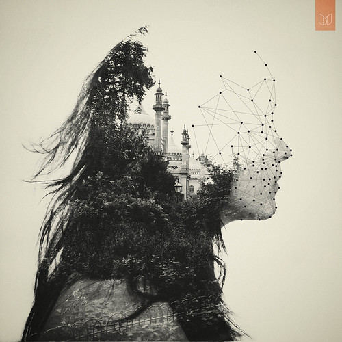
1000+ FAVS :) // Double exposure // Vector., originally uploaded by •DΛN MOUNTFORD•.
This guy creates amazing double exposures, I have serious talent envy right now
Thursday
Mount Kimbie - Before I Move Off
Directed by Tyrone Lebon
I love this video so much, I don't even know why? Something about it really struck a chord with me. I love the flickering photos which tell a story, even something like this could be something to think about for my title sequence.
Wednesday
Title sequence ideas
I want to take quite an illustrative route in my title sequence and avoid using film where possible. One idea I've had through browsing the internet is to create a large illustration which tells the story of Robin Hood or has objects relating to the story and filming it panning down/across. Using as little effects in post production as possible.
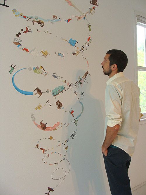
Another idea I've had to create a book which features the credits/objects etc and film the book being flicked through, like the beggining of Shrek, where the story is introduced through a storybook. However I'd like to take a more photographic/illustrative approach and possibly create an interactive book and film someone using it.
Rethink Scholarship at Langara 2010 Call for Entries from Rory O'Sullivan and Simon Bruyn on Vimeo.
Sunday
Metronomy - She Wants
Directed by Jul & Mat (www.juletmat.fr)
I like this video for its simplicity which makes for interesting viewing, as immediately you realise that what you're watching is being played backwards, however I didn't expect the scenes to turn, and I really liked this approach. The video itself feels like a continued, darker version of the bands previous video for A Thing For Me. Also the QR code featured as a poster within the video leads to a link to download the song for free, which is really clever and innovative as I haven't heard of that being done before.
Creep - Days
Directed by Warren Fischer
I love this video just for the effects used within it alone, alot of them would be so easy to recreate which I really want to try to do, I especially like the shots of the band members where they're covered in glitter. The mood of this video is perfect, trippy and dark.
Tuesday
Day 1 Filming - Emmanuel House
Some pretty intense shit going down...obviously.
Today was our first filming day for Emmanuel House, a
Subscribe to:
Comments (Atom)


