Thursday

Mind map type thing :)

collection of images/walkthrough of what i'm thinking...

I wouldn't mind a bit of an eccentric, castle looking feel to the rooms, tall ceilings, big windows..

like the colours, eccentric feel.

ideas for objects. i really want a massive teacup somewhere in the room .. i'm thinking alice in wonderland.

ahhhh i loooooove this, i want my house like this when i'm older ;)

more textures kind of stuff just for kicks


i like this alot, this is another approach i wouldnt mind taking - arts and crafts, although i dunno how i would do this in 3d studio max. i like the idea of a spire with clouds around it. with a maaaaassive moon thats right outside the window


if i could, i'd have the indoors like this, but i'm guessing thats gonna be impossible


another idea i really like, doodle the furniture i want to include then have them imposed on boxes (would save on effort of making them aswell ;) )


very alice in wonderland-y... i like the colours


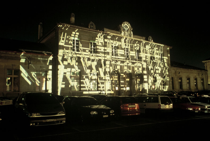
just something a bit more modern, never hurts to include it as i do reckon i'll end up with alot of geometric stuff in my final design

teacup!

i just like this picture :)

Monday

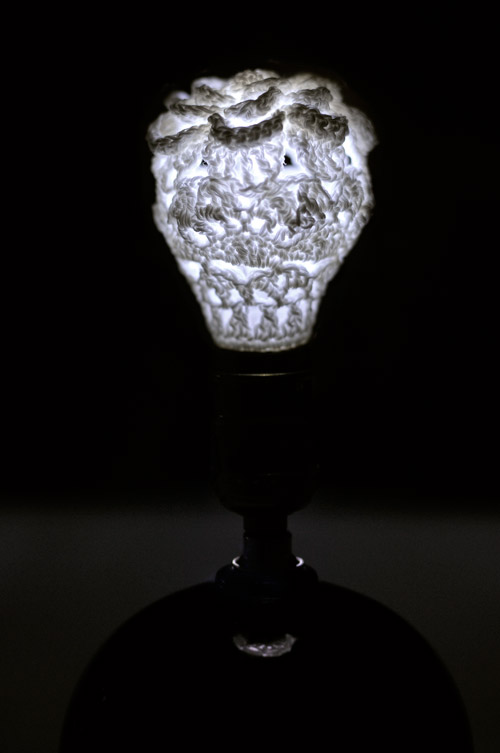
Woven Lightbulbs

How good is this idea? Lace lightbulbs. Making them an artform of their own. Her description for her inspiration is clever also.


"If we are now buying light bulbs that will last years instead of being quickly replaced disposables, we should consider giving more appreciation for the lightbulb as an object. Handmade in crocheted cotton and formed over a conventional lightbulb shape, LACE invites a reinterpretation of the minimalism of a bare bulb."

I think this a really clever way to look at things. Designer light bulbs could become an everyday occurance, and it wouldn't surprise me if more stuff like this did become common. Household items that are meant to last a lifetime. But while we're of living in the middle of lots of technological breakthroughs with 3D and HD and whatever D, it might just be lightbulbs for now.

Thursday

Just messing..

 
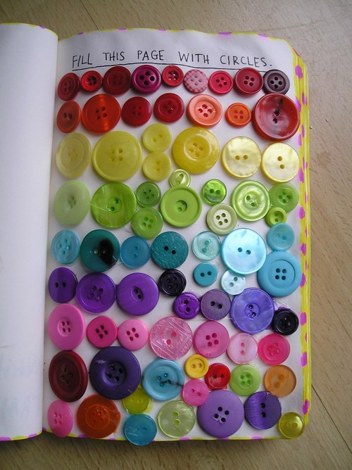
Messing around with textures.. loving lace at the moment.

Friday

Motion Photography

So to speak...

motion photography 02 from Macgregor on Vimeo.

I found this video (??) on vimeo and thought I'd share it. It's a bit of a wierd concept as its obviously not photography but it's so short it would be pointless to be called film? Dunno anyway - I like it. As a concept it's quite fresh and with the way technology is moving these days with things like the iPad looking to be like the modern day magazine something like this might actually become popular. I like how the text moves with the frame of the shot to give a consistency. It also makes me wonder if the text was actually printed onto glass or added afterwards. I think I would kind of like it more if it was there all along. This is kind of a nice balance between the two mediums. But to be honest it reminds me of Harry Potter or something, moving images like that. And if you're reading an article and something keeps moving in the corner of your eye - how distracting would that be? It is something to consider though, cause who knows? It could become really popular.

Thursday

more


I like the shots in this and also the birds eye view scene was all done on computer which I thought was odd/interesting. This video was directed/produced/edited all by Steven Ilous. I dunno what I like most about the video. The narrative (or is it a plot I can never remember) the fact it loops, the scenes used. The use of the tv and how the song changes with the shots. How even the natural happenings in the background add to the tension.

ok so I read back what I wrote ^^ ( I will leave it there just for the sake) and I thought er? What. I didn't really elaborate what made me put this on here. So I sat and watched it again, kind of picked it apart and analyzed what I thought the imagery meant.

iheartcomix - record label. unusual to see that on a music video
blends into setting
sound/thunder create mood - feels like a film (makes more sense that the record label was included)
eerie sound effects create atmosphere
immediate feeling of crime scene (police radio)
tension
shocks the audience with gunshot
suspense
interesting angle, draws attention - don't often see that kind of camera use
title - again film effect
puts it into context - tv
(referring also to small artist? big break on tv with unusual video?)
birds eye view shot, returns back to original setting, shows a change in time
night time shots - intrigue audience
pulls up to garage. imagery and music obviously well considered
tension built with music/slow motion.
moth in the background, very casual but again adds to the tension. makes the situation seem ordinary although we've already been given a 'horror' setting
we see the masked person in the car, shot designed to make that the focus with out making it completely obvious through use of shadow
again use of tv, putting into context again
cctv footage - interesting use of effects, good way to explain whats going on without changing scene completely
sound of gunshot could be ignored as part of the song, we are made aware of it through visuals.
tension is again built through long shots/extreme close ups
night shot of the car headlights adds eerieness
overhead shot makes you aware of the police, reminds you of the beginning with the police radio
we see the body being dragged, the masked man will most likely be sent to prison for murder/robbery?
boom. toxic is dead. end. loop.

..think I covered everything? any other opinions?

...

Tuesday

Mock Trailer for Maze


Jade made this in iMovie, just saw it on her blog so thought I would repost it. She did a really good job of it. Really excited to look over the film now as I haven't seen it yet! :)

Thursday

I need a guide..aksjdaskd

Argh getting a bit frustrated with things in general cause I dunno what I want to go into at all? My minds in a bit of an overdrive trying to work out what I like/get inspired by. Made some collagey things again. Ones just random images I liked the look of, another is for the upcoming animation project, which I hope I enjoy. Film.. hmm well. I expected to like it, but it's very monotonous and I dunno if I could cope with that as a full time occupation. So possibly if I ever did go into film, I'd like to take more of a creative role of director where you can kind of envision the film, rather than producer where you're organizer, and I'm the least organized person I know! So yeah.. bit confused at the moment with what I want from the course etc.


And the 3d design one...


I think I've kind of decided in my head that I'm (some how) gonna take a more sketchy approach to the new project since I suppose I can? Even if my end result ends up a flat plane with a circle plonked on top at least I'll have the ideas to back up that although I can't work the programme I'm capable of the legwork? 90% contribution, 10% execution.

Tuesday

...this really makes me want to do a sketchbook..

like right now.

Rethink Scholarship at Langara 2010 Call for Entries from Rory O'Sullivan and Simon Bruyn on Vimeo.

Oops

I've completely forgotten about my blog the past couple of days so thought best to update
film project..
We've sorted out our script although still not 100% on our extra scene. Each of us are gonna do a story board and see what kind of look we get, then merge them together to get an idea of whats its all gonna look like for shots etc. Also I've asked a friend to play our character, Sam, and waiting to hear back cause I don't think he likes the idea of playing a weirdo, so shall see what'll happen there. Trying to get filmed tomorrow (Wednesday) but at the rate we're at at the moment I think might be better to do it on Thursday and have tomorrow as a bit of a practice with the equipment.