Argh this is so frustrating, building my interactive narrative for my final piece is killing me! For some reason it's deciding to skip frames, and I have no idea why, I checked the coding loads of times and it's still not happening, then deleted all the actions to recode it and now it wont let me add actions.. :| WORST. PROGRAM. EVERRRRRR!
initial draft by ~holleighwood on deviantART
theres the link for my first draft of my narrative, I keep trying but seriously can't code the thing :( if you click previous on random frames it jumps to and from and u might be able to see the other pictures...........
Friday
Thursday
Interactive Narrative
I've been playing about with flash here and there since we got the brief, and broke the template about 20 times since we got given that.. Not good. Not feeling flash at all.. I came up with a narrative based on the theme of superstitions initially -
 This was my original little bird creation cause I made it white later. But then I ended up changing my idea pretty much all together. I redid the bird cause I didn't like that one, it didn't have the look I wanted for my animation, so I made this one -

Then started messing about with it, giving it tattoos, top hats and monacles...

So on that note I've decided that my animation is going to be a set up like this -

The user can choose from a variety of different birds in different outfits, clicking previous, next to navigate, then if they click choose it puts the bird in a setting.
It has no plot but this is only narrative, so its ok ;) ?
- 1. Start screen would begin with a dove
- 2. Frame would show the dove being covered in black paint which has been left on a ladder/scaffolding (if you walk under these its supposed to be bad luck)
- 3. Dove would then turn into a magpie because of the paint
- 4. User will have the option to make a friend or not (magpies 1 for sorrow, 2 for joy)
- 5a. If user chooses to have a friend then they go shopping for shoes.
- 6a. Then goes home and puts the shoes on the table (bad luck)
- 5b. If user chooses no then the magpie/dove goes for a walk and it begins to rain.
- 6b. Magpie/dove runs indoors and someone puts an umbrella up indoors
- 7b. Rain stops and magpie leaves and steps in dog poo on the way home
 This was my original little bird creation cause I made it white later. But then I ended up changing my idea pretty much all together. I redid the bird cause I didn't like that one, it didn't have the look I wanted for my animation, so I made this one -
Then started messing about with it, giving it tattoos, top hats and monacles...

So on that note I've decided that my animation is going to be a set up like this -

The user can choose from a variety of different birds in different outfits, clicking previous, next to navigate, then if they click choose it puts the bird in a setting.
It has no plot but this is only narrative, so its ok ;) ?
Wednesday
Lecture 1 - 27th October
Lecture was about different design cycles, and suppose getting us into the habit of
research (discover) > develop (developing) > refine (defining) > final piece (delivering)
did that already at college so I'm kind of used to it, although worked in sketchbooks there. Prefer not having those though and using this.
Also discussed about how when going through this process that we have to think of our target audience, how they will "feel", taking into account any possible impairments such as blindness or hearing difficulties.
Talked about design methodolgies too,
Reverse engineering (pulling apart an existing product to rebuild something new/better)
Prototyping (working with ideas to build something until it works)
Open source (editing or manipulating something which is designed to be done so by other people)
Market research (finding out what the audience wants and catering to that need)
Personally I like to ask peoples opinions throughout my process so I would say my own methodology would lean towards market research, although I think with most products/projects each of these methodolgies would come into play, some more than others.
Design processes and methodologies are different!
Research, existing flash work
Animator vs. Animation by ~alanbecker on deviantART
I found this flash on deviant art, apparently it took 3 months to create, and after playing with flash for 10 minutes I'm really not surprised. Thought it was funny, although it doesn't really have a narrative but still.. :)
Friday
Research, Tick Magazine
 Amazing cover or whaaat! Its from tick magazine (think the link is private until it launches) and features Paul Griffiths, designer/creator of clothes brand Babycakes, made from cassette! I can't tell if it's digital manipulation or whattttt cause there are no hq versions on the internet, or even about the magazine itself cause it hasn't launched yet, it is launching online though on the 1st of November, and will be available in physical copies soon after.
On the note of babycakes actually I might as well pop some of their stuff on, this is the front of a flyer/menu from one of their parties. I like the colour/font use on here. This is really easy to create in photoshop but I think if I was handed that it would be something I would actually read. The drinks sound nice as well ;)

Research, Wigflex

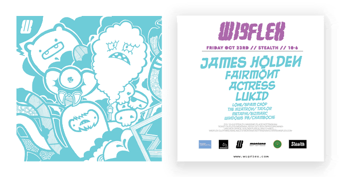
I saw this flyer on my flatmates wall and was just like WHAT IS THAT! Soon found out that it's a flyer for local club Stealth, design by (as far as I can tell) local designer, Spam Chop, who also runs Wigflex nights at the club. I love the design of his characters and use of colour. The ones featured here remind me kind of manga styles. I love busy things like this and would love to include some kind of nod to this kind of design in my work.
Saturday
Research, Will Bryant
Will Bryant is an illustrator who is kind of along the same lines of So Me,
in other words = ♥
Go on his flickr here,
Cause I can't pick one thing I like the most haha
in other words = ♥
Go on his flickr here,
Cause I can't pick one thing I like the most haha
While I'm at it, more research..
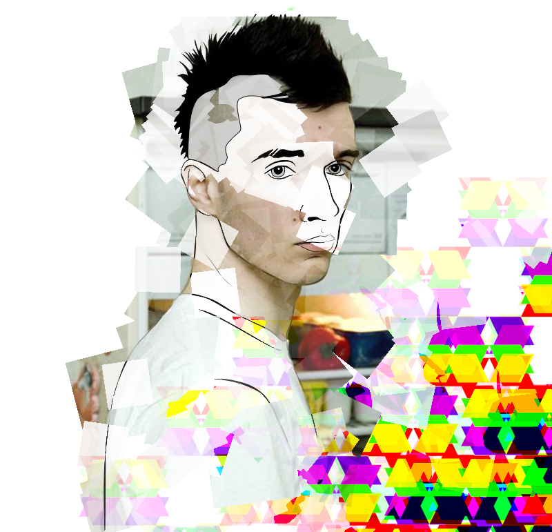
ANOTHER post, of a music video. This ones for Kanye West, Welcome to heartbreak.. The video was directed by Nabil Elderkin who is also a photographer, and uses an effect called photomoshing or datamoshing, which gives a unique, analogue effect, this video is definately my favourite of this year just for the mood of it.. :)
+++++++++ also.. some work from my last college project, which was inspired by this music video. Love this piece so much its up there as one of my favourite works from college.

+++++++++ also.. some work from my last college project, which was inspired by this music video. Love this piece so much its up there as one of my favourite works from college.

Research, Alberto Seveso


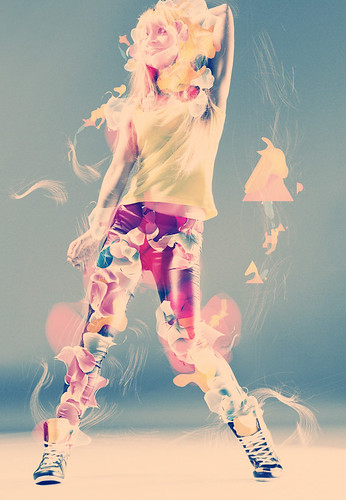
I looooooove this so much, Alberto Seveso is an Italian illustrator, who I found cause he designed cover work for a band I like. I have done some work inspired by him.. did it in like August/September but still relevant I supppoooooosssse...
 I can't remember exactly what I did now cause it was a while ago.. made the coloured shapes just randomly in photoshop and then used the original photo but used a few brushes with it to get the layered effect. To do the actual effect Seveso uses you use smart layers, masking and displacement maps... I think..
Research, Kesh

Another Kid Cudi video
Kid Cudi - Day 'N' Nite [Crookers remix] (Directed by BBGUN) from bbgun on Vimeo.
Found this version of day and night while I was looking for the original version, thought since I'm kind of leaning to video's at the moooo may as well pop it on.. I've got nothing to do today until tonight so I'm just gonna go on a mega update on this thaaaaaang me thinks! Might even do SOME WORK :| jesus christ its a Saturday and I'm considering work, whats the world coming to :'(
Uni work, stop motion animation
The stop motion from the other day, my group is the last on the video, starts about 1.30 I think.. obviously best til last ;) wahaaaaaaaaaa
I liked this :)
Research, SO ME music video
The video for Kid Cudi's song, "day and night" it was directed by So Me, illustrator for Ed Banger records, who originates from France. His style is recognizable because of his use of simple, clean and often childlike illustrations. I think that the illustrations in the video shown here show his style off perfectly. He shows the effects of drugs which the songs talks about in a playful, yet sinister way. The type of animation he uses here is called rotoscoping and has recently become popular in music videos. It is done by taking some video footage then digitally sketching over each frame to create a seemless animation. I really like this style and would like to use it in my own work adapting it myself to create something different. It is an old technique and was used by Disney in works like Snow white and the seven dwarfs, although it was originally inveneted in 1915 by Max Fleishcher, an American animator. Originally it was used by making video footage of movement and then drawing over each frame on a cell to create lifelike movement, this was its main purpose, rather than simply tracing an image.
I did recreate the technique using the resources available on NOW, using photoshop, which I was able to do, however I couldn't save it so have nothing to show for it :(
I did recreate the technique using the resources available on NOW, using photoshop, which I was able to do, however I couldn't save it so have nothing to show for it :(
First brief, Interactive Narrative
Tried to do rotoscoping the other night, but it didn't really go to plan.. Well it kiiiiiiiind of did but I couldn't save it so have nothing to show for it :|
Was given the brief yesterday for our narrative project, have to make a 10 frame (at least) animation which has a narrative. It must last at least three minutes, and we have been given a template flash file to work from. The animation will have agents which affect the story. We did a brain storm in lesson and I thought of a few things -
- A house in which lights switch on/off, and when all the lights get switched on the fuse goes and the screen goes black. I got the idea from a game on my iPod, and its also kind of similair to the game lights out where you press a button and the lights change colour all around it.
- Feeding an animal and the animal gets skinny/fat
- Pulling a loose thread on a jumper and it unravels if you pull too many times
- Chewing gum, choosing whether to blow it up, if it gets too big it pops
- Stealing items in a house, each item has a weight and if you carry to much you get caught
- Little Miss Muffet sat down and you can choose what she does to the spider like crushing it, becoming friends, pouring porridge on it...
I like all these different ideas not sure which I'm going to look at, will look at some artists I wouldn't mind robbing some effects from :) think I'll create each frame in photoshop but scan in drawings/ textures.
We have 9 contact hours to complete it..
Errrrrrrr I have no idea how to use flash :| :| :| GOOD TIMES
Tuesday
Pin hole cameraaa
Research, SO ME

So Me is a french illustrator, who is designer for record label, Ed Banger records, he's also created video's for Kanye West and Kid Cudi using rotoscoping. I really love this type of animation and I want to try to do it.. somehow, ha.
Found the leaflet below in the Jack Wills shop, in a similair style to SO ME, I like it :)
Friday
Research, Lock Sin
Tuesday
First blog :)
Subscribe to:
Comments (Atom)


